
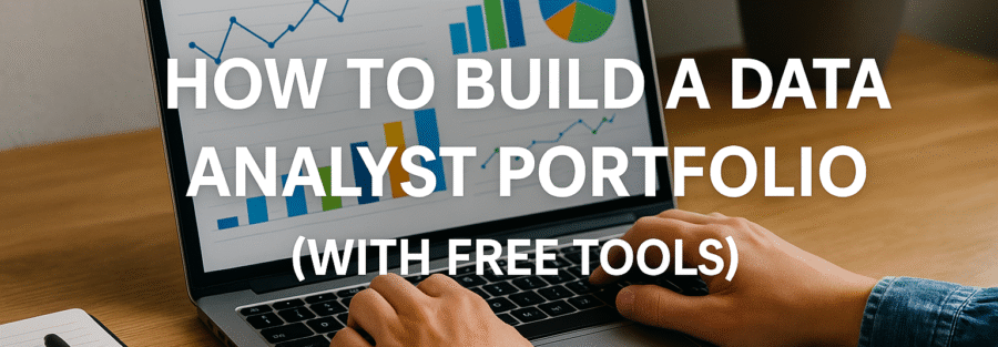
Introduction to Data Analyst Portfolios
Why You Need a Portfolio as a Data Analyst
Let’s face it—just having a resume isn’t enough anymore. Employers and recruiters want more than a bullet-point list of your skills; they want proof. They want to see what you can do. That’s where a portfolio comes in. Think of it like your digital brag book. It’s your chance to show your work, walk through your thinking, and stand out from the crowd.
As a data analyst, your work is practical, detailed, and visually compelling. Whether it’s uncovering patterns in messy datasets or visualizing sales trends, your skills are best shown through real-world examples. And with competition growing fiercer in data roles, a portfolio can be the difference between landing an interview or getting passed over.
A well-built portfolio proves you know your stuff—data cleaning, visualization, analysis, and interpretation. It tells employers, “Look, I’ve done this before, and I can do it for you too.” Even if you don’t have professional experience, a few well-crafted projects can highlight your potential. No fluff, just real data, real insights, and real skills.
What Makes a Good Data Analyst Portfolio?
Not all portfolios are created equal. Some are just code dumps. Others are so flashy they forget the purpose. A good data analyst portfolio balances form and function. It tells a story through your projects, is easy to navigate, and highlights your skills without overwhelming the viewer.
Here’s what makes a data analyst portfolio truly pop:
- Diverse Projects: Include a variety of domains—finance, marketing, healthcare, etc.—to show your flexibility.
- Clear Documentation: Your code and notebooks should be easy to follow. Write like you’re explaining to someone new to the project.
- Insightful Analysis: Show not just what the data says, but why it matters.
- Visual Appeal: Dashboards, charts, and graphs should be clean, meaningful, and well-labeled.
- Professional Presentation: Even if it’s hosted on GitHub, treat it like a personal website. Clean, organized, and professional.
Laying the Groundwork
Define Your Goals and Target Audience
Before you even touch a dataset or open GitHub, pause for a moment. Ask yourself: “What’s my goal with this portfolio?” Are you trying to land a job as a junior data analyst? Freelance for startups? Transition from a different field? Your goal shapes everything—from the tools you use to the types of projects you include.
Next, think about your audience. Who’s going to look at your portfolio? Most likely, it’s recruiters, hiring managers, or maybe other data professionals. These people are busy. They don’t want to sift through dozens of confusing files. They want clarity. So make it easy for them. Think about their perspective—what would you want to see if you were hiring someone?
Define your narrative. Maybe you’re a marketing analyst who shifted into data science. Your projects can reflect that. Maybe you’re a stats major passionate about sports analytics—show it. When your portfolio tells a consistent story, it’s far more memorable.
Identify the Skills You Want to Showcase
Now let’s talk about you. What skills are you trying to spotlight? This is your stage, and you get to choose what you put in the spotlight.
Here are the core skills most data analyst portfolios should highlight:
- Data Cleaning & Wrangling: Using tools like pandas in Python or Power Query in Excel.
- Exploratory Data Analysis (EDA): Identifying patterns and trends.
- Data Visualization: Using libraries like Matplotlib, Seaborn, or tools like Tableau and Data Studio.
- Statistical Analysis: Showcasing hypothesis testing, regressions, and forecasting.
- SQL Proficiency: Working with relational databases and writing complex queries.
- Storytelling: Your ability to communicate insights clearly.
Once you’ve nailed down the skills, align your projects accordingly. If you’re strong in SQL, have at least one project where complex queries are front and center. If you want to prove you can build dashboards, make a killer one on Tableau Public or Data Studio.
Choosing the Right Free Tools for Your Portfolio
GitHub: Your Online Portfolio Repository
When it comes to free tools, GitHub is the undisputed champion for data analysts. Think of it as your online resume—but better. It’s not just for developers. GitHub lets you store your code, notebooks, datasets, and documentation in a structured and accessible way.
Here’s why GitHub is a must-have:
- Version Control: Track changes in your projects over time.
- Public Sharing: Showcase your work to employers without emailing bulky files.
- Professionalism: Recruiters love it. It shows you’re organized and understand collaboration tools.
- ReadMe Files: You can write detailed summaries of your project, walk the viewer through your steps, and even add visuals.
Structure your GitHub like a portfolio:
- Each project gets its own folder.
- Inside: your Jupyter Notebooks, scripts, data (or links to data), and a well-written
README.md. - Use clear naming conventions like “Customer_Churn_Analysis” instead of “Project1.”
Add a pinned repositories section to your GitHub profile to highlight your best work. You don’t need to be a coding wizard to use GitHub—there are tons of tutorials out there. Start simple, learn as you go, and keep it clean.
Tableau Public: Interactive Dashboards Made Easy
Tableau Public is the secret weapon of many aspiring analysts. It’s free, easy to use, and gives your data projects a serious wow factor. Want to make your work interactive and visually appealing? Tableau’s your guy.
Why Tableau Public rocks:
- Drag-and-Drop Interface: No coding needed.
- Interactive Dashboards: Users can filter, drill down, and explore.
- Cloud-Based Portfolio: Your dashboards are published online, and each gets a shareable link.
- Professional Appeal: Hiring managers love seeing real, interactive dashboards.
Use Tableau to visualize data in ways that pop: bar charts, maps, scatter plots, and dashboards. Build visual stories around real-world datasets—like global COVID-19 trends, Netflix ratings, or sales data. Each dashboard should include context and a narrative. Don’t just show the data—explain it.
Just remember to always anonymize data if you’re working with sensitive information, even if it’s just a demo.
Kaggle: Showcasing Notebooks and Competitions
Kaggle isn’t just for competitions—it’s a goldmine for free datasets and a great place to show off your analytical chops. You can create public notebooks where you walk through your data exploration, modeling, and visualization process.
Here’s how Kaggle helps your portfolio shine:
- Free Datasets: From Titanic to Starbucks to NBA stats, it’s all there.
- Notebook Hosting: Write and share Jupyter Notebooks right in your browser.
- Community Engagement: Get upvotes, comments, and feedback on your work.
- Competitions: Show how you perform under real constraints.
Don’t just join Kaggle and expect magic. Actually do a couple of thorough, well-documented projects. Explain your thought process. Why did you drop certain features? How did you choose your visualizations? That’s what sets you apart.
You can even link your best Kaggle notebooks to your GitHub or embed them in a personal website. Cross-platform synergy? Yes, please.
Google Sheets and Google Data Studio
If you’re just starting or coming from a non-coding background, Google Sheets and Google Data Studio are incredible (and free!) tools to get going. These platforms let you demonstrate data analysis and visualization without heavy tech skills.
Google Sheets:
- Great for data cleaning and small analyses.
- Ideal for sharing and collaborative work.
- Easy to integrate with external data sources (e.g., APIs or add-ons).
Google Data Studio:
- Create interactive dashboards with just a few clicks.
- Connect to Google Sheets, BigQuery, and more.
- Fully cloud-based and easy to share.
Use these tools to build simple yet elegant dashboards and reports. For example, try analyzing your personal finance data or a public CSV of election results. The key? Make it understandable, relevant, and visually appealing.
These tools might seem basic, but they’re powerful when used creatively—and they show you’re resourceful.
Finding and Selecting Your Projects
Use Public Datasets
One of the first questions many aspiring analysts ask is, “Where do I find data to analyze?” The good news? The internet is full of high-quality public datasets—and most of them are free.
Here are some of the best sources:
- Kaggle Datasets: Tons of free CSVs and APIs to explore.
- Google Dataset Search: Like Google Search, but only for datasets.
- data.gov: Official U.S. government data on nearly every topic.
- UCI Machine Learning Repository: Home to hundreds of classic datasets.
- World Bank, IMF, and UN Data: Global statistics with powerful insight potential.
When choosing a dataset, consider your goals. Want to show off EDA and visualization skills? Go for a clean, interesting dataset like Netflix reviews or Spotify streaming stats. Want to dive into data cleaning? Pick something messy—real-world data often is!
Also, think about relevance. Try projects that connect to industries or roles you’re interested in. Love sports? Do a fantasy football trend analysis. Passionate about finance? Analyze stock market data or crypto trends.
Types of Projects That Impress Employers
Not all portfolio projects are created equal. Some scream “entry-level.” Others shout “ready to hire.” Your goal? Lean into the second category.
Here are 5 project types that employers love:
- Customer Segmentation: Use clustering to segment users in an e-commerce or telecom dataset.
- Sales Forecasting: Show time-series analysis and make predictions.
- Churn Prediction: Classic machine learning problem with real business impact.
- Marketing Campaign Analysis: Track effectiveness of ad campaigns and ROI.
- Interactive Dashboards: Summarize key KPIs in a user-friendly way.
Go deeper than just surface analysis. Focus on drawing real insights and telling a business story. Include an “Executive Summary” section in every project to explain what you found, why it matters, and what action could be taken.
Employers don’t just want someone who knows Python or SQL. They want someone who can use those tools to solve problems. Your projects should reflect that mindset.
Structuring Your Project from Start to Finish
Every great portfolio project follows a structure—like a well-written essay. Random code and screenshots won’t cut it. You need a clear beginning, middle, and end.
Here’s a project blueprint:
- Introduction/Problem Statement: What is the dataset? What’s the goal?
- Data Cleaning & Preparation: Handle missing values, drop duplicates, fix formats.
- Exploratory Data Analysis (EDA): Use visuals and stats to understand patterns.
- Feature Engineering (Optional): Create new variables that help with analysis.
- Modeling/Insights: Apply statistical tests or ML models. Share insights.
- Visualization: Present findings through charts, dashboards, or plots.
- Conclusion & Recommendations: Summarize takeaways and next steps.
Wrap it all up with documentation. Use markdown cells in notebooks, add comments in code, and write a project summary in plain English. Make it easy for someone to understand your work, even if they aren’t technical.
Building Your Projects
Step-by-Step: From Data Cleaning to Insights
Let’s break down the anatomy of a winning data project. This is where your skills come to life. Every good project follows a logical flow—from messy data to meaningful insights. You’re not just crunching numbers; you’re telling a story.
Step 1: Data Cleaning
Start with the basics. Most raw datasets are messy. This is your chance to shine by turning chaos into structure. Remove duplicates, handle missing values, fix data types, and normalize your variables.
Key skills to demonstrate here:
- Using Python libraries like Pandas and NumPy.
- Creating functions to automate repetitive cleaning tasks.
- Logging or documenting changes clearly.
Step 2: Exploratory Data Analysis (EDA)
Once your data is clean, dive into exploration. EDA is where you find trends, anomalies, and correlations.
Use visuals like:
- Histograms and bar charts to show distributions.
- Boxplots to spot outliers.
- Scatter plots to find relationships.
Explain what you see! Don’t just show a heatmap—interpret it. Why are two variables correlated? What’s interesting about the outliers?
Step 3: Insight Extraction and Recommendation
Wrap it up with insights. What did the data reveal? What action can a business take based on your analysis?
Don’t just say, “Sales dropped in Q3.” Say, “Sales dropped 18% in Q3, likely due to delayed product launches and reduced ad spending. Consider reallocating Q2 budget earlier.”
This is what separates a technician from a true analyst.
Visualizing Your Data: Best Practices
Visualization isn’t just decoration—it’s storytelling. And good visuals can elevate your project from average to outstanding.
Follow these key visualization principles:
- Keep it simple: Don’t overload with colors or 3D effects.
- Use appropriate charts: Pie charts for parts of a whole, line graphs for trends, bar charts for comparisons.
- Label everything: Titles, axes, legends—make sure everything is clear.
- Highlight insights: Use annotations, callouts, or color emphasis to direct attention.
- Be consistent: Use the same color scheme and font style across visuals.
And choose your tool wisely. Tableau is great for dashboards. Matplotlib and Seaborn are perfect for coded visualizations. Google Data Studio is ideal for sharing.
A few visuals to always include:
- KPI summary dashboard
- Time-series chart (if relevant)
- Breakdown by categories or segments
Also, explain your visuals. Don’t assume the reader knows what they’re looking at. A simple sentence like, “The sales dip in March corresponds with a marketing pause,” adds valuable context.
Writing a Project Summary That Speaks Volumes
Think of your project summary as your elevator pitch. This is the first thing people see when they open your GitHub repo, Kaggle notebook, or website.
An effective project summary should include:
- Project Title: Clear and catchy.
- Goal: What were you trying to achieve?
- Tools Used: Python, SQL, Tableau, etc.
- Dataset: Where it came from and what it contains.
- Process: Quick overview of the steps (cleaning, EDA, insights).
- Key Findings: What did you discover?
- Business Value: Why does this matter?
Here’s an example:
“This project analyzes customer churn data for a telecom company using Python and Seaborn. After cleaning and exploring the dataset, I found that contract length and monthly charges are key indicators of churn. I recommended offering discounts for long-term contracts to reduce churn by an estimated 15%.”
Make sure your summary is at the top of your README.md or project description. Think of it as your project’s “about me.”
Organizing and Showcasing Your Portfolio
How to Structure Your GitHub Repository
A clean GitHub repo makes a huge impression. If someone opens your profile and sees a jumble of files with no explanation, they’ll click away. But a neat, well-organized structure? That says you’re professional and ready to work.
Here’s a suggested folder structure:
kotlinCopyEdit/Customer_Churn_Analysis/
  ├── data/
  │   └── churn_data.csv
  ├── notebooks/
  │   └── churn_analysis.ipynb
  ├── images/
  │   └── churn_chart.png
  ├── README.md
  └── requirements.txt
Best practices:
- Use
README.mdas your project homepage. - Add screenshots of your visuals.
- Include a
requirements.txtwith the libraries you used. - Keep your folder names consistent and descriptive.
- Avoid uploading large datasets; instead, link to them.
Pin your top 3–6 repositories to the top of your GitHub profile. Make sure they show a range of your skills—EDA, SQL, visualization, modeling, storytelling.
Adding Documentation and ReadMe Files
Documentation is your silent salesperson. It explains your project, helps others replicate your work, and shows attention to detail.
Your README.md should include:
- Project Title & Description
- Table of Contents (for long projects)
- Installation Instructions
- How to Use the Code
- Example Outputs or Visuals
- Credits & Dataset Source
- Contact Info (optional)
Use Markdown for formatting:
#for headers*or-for bullet pointsfor visuals
You can even embed gifs or Loom videos to show how your dashboard works. The more interactive and informative, the better.
Creating a Personal Website (Free Options)
A personal website ties everything together. It’s your own little corner of the internet—a place to showcase your projects, tell your story, and make it easy for employers to find you.
Free platforms to build your site:
- GitHub Pages: Great for tech-savvy users. Can host Markdown or HTML pages from your GitHub repo.
- Carrd: Super simple, modern-looking one-page websites.
- Wix or WordPress: Drag-and-drop options with lots of templates.
- Notion: A flexible, easy-to-update space. Works well for portfolios.
Your website should include:
- Home/About Page: Who you are, what you do.
- Projects Page: With links to GitHub, dashboards, and summaries.
- Contact Page: Email, LinkedIn, GitHub profile.
Keep it simple and professional. Use a clean layout, readable fonts, and your own voice. Your website doesn’t need to be flashy—it needs to be you.
Promoting and Maintaining Your Portfolio
Sharing on LinkedIn and Other Platforms
Creating your portfolio is just the first step. Now it’s time to put it in front of the right people. Social platforms, especially LinkedIn, are powerful tools for getting eyes on your work.
Here’s how to promote your portfolio effectively:
- LinkedIn Posts: Share a new post every time you complete a project. Include a brief summary, a visual, and a link to GitHub or your website.
- LinkedIn Articles: Go deeper by writing long-form posts explaining your process and insights.
- Twitter/Reddit: Communities like r/datascience or #100DaysOfCode are great places to share your progress.
- Medium: Publish your analysis in story format. Use visuals and plain English to engage readers.
Don’t just drop links—engage. Comment on others’ posts, ask for feedback, and respond to questions. Treat your online presence like a conversation, not a broadcast.
And yes, it might feel awkward at first. But putting yourself out there builds your personal brand and helps recruiters find you organically.
Updating Your Portfolio with New Skills and Projects
A static portfolio is a dead portfolio. The data world evolves fast—your portfolio should, too. Think of it like your garden: water it regularly and watch it grow.
Tips for keeping it fresh:
- Add new projects every quarter. Even small ones. Show continuous learning.
- Revise old ones. Apply new techniques you’ve learned. Clean up documentation.
- Update your skills list. New tools like dbt, Power BI, or Python libraries? Showcase them.
- Reflect on feedback. Got comments on LinkedIn or GitHub? Use them to improve.
Also, create a “Version 2.0” of your earlier projects. Maybe your first EDA was clunky. Redo it with better visuals and clearer insights. This shows growth and maturity, which employers love.
Final Thoughts and Tips
Common Mistakes to Avoid
While building a portfolio, it’s easy to slip into traps. Here’s what to avoid:
- Too Many Projects, Not Enough Depth: Three strong, well-documented projects beat ten shallow ones.
- Messy Code: Unreadable code turns people off. Use comments and organize logically.
- No Context: A chart without explanation is just noise.
- Overuse of Templates: Your portfolio should reflect you, not just mimic tutorials.
- Neglecting Non-Tech Skills: Storytelling, communication, and business acumen matter just as much.
Focus on clarity, impact, and professionalism. The goal isn’t to look like a genius—it’s to be someone others want on their team.
How to Stand Out in the Job Market
Let’s be real: the job market is competitive. But a standout portfolio can give you a major edge.
Here’s how to differentiate yourself:
- Niche Focus: Target your projects to industries you love—sports, finance, healthcare, etc.
- End-to-End Projects: Show the full process, not just the fun parts.
- Interactive Elements: Dashboards, filters, animations. Make it engaging.
- Personal Branding: A cohesive style across your GitHub, website, and LinkedIn.
- Real-World Application: Analyze current trends or real business problems.
And don’t underestimate soft skills. Pairing data know-how with clear communication and domain understanding makes you a unicorn in the data world.
Conclusion
Your portfolio is more than a collection of projects—it’s your personal brand. It tells your story, showcases your skills, and opens doors in the data industry. And guess what? You don’t need fancy tools or a big budget to make it happen.
Start simple. Use GitHub, Tableau Public, and Google Sheets. Find datasets that excite you. Solve real problems. Share your journey online. And most importantly—keep going.
The more time you invest, the more powerful your portfolio becomes. Employers don’t just want data analysts—they want problem solvers. So show them what you can do.
FAQs
What should be included in a data analyst portfolio?
A strong data analyst portfolio should include 3–6 well-documented projects that demonstrate a range of skills, such as data cleaning, analysis, visualization, and storytelling. Each project should include code, visuals, a summary, and insights that show your problem-solving ability.
How many projects should a data analyst have in their portfolio?
Three to five high-quality projects are ideal. These should be diverse, showing different tools, industries, and techniques. It’s better to have fewer polished projects than a bunch of unfinished ones.
Can I build a portfolio without work experience?
Absolutely. Many data analysts land their first job with self-driven portfolio projects using public datasets. The key is to treat each project like a real job—solve real problems, document clearly, and present your insights professionally.
Is a personal website necessary for a portfolio?
While not required, a personal website can set you apart. It centralizes all your work, looks professional, and is easy to share. Free options like GitHub Pages, Notion, or Carrd make it simple to get started.
How do I get feedback on my portfolio?
Share your work on LinkedIn, Reddit, or Kaggle. Join data communities on Slack or Discord. Ask mentors, peers, or even recruiters for input. Feedback helps you improve and shows you’re open to learning.