
Executive Summary
Building your first Power BI dashboard can seem daunting, but with the right approach and understanding of fundamental concepts, you’ll be creating professional, interactive dashboards in no time. This comprehensive guide walks you through every step—from downloading Power BI Desktop to sharing your finished dashboard with stakeholders. Whether you’re analyzing sales data, tracking KPIs, or monitoring business metrics, Power BI provides the tools you need to transform raw data into actionable insights. By following this guide, you’ll master the essential skills needed to create visually appealing, performance-optimized dashboards that drive data-driven decision-making.
Let’s go through the “Complete Guide to Building Your First Power BI Dashboard.”
Part 1: Understanding Power BI – The Foundation
What is Power BI?
Power BI is Microsoft’s powerful business intelligence and data visualization platform that enables you to connect to various data sources, transform raw data into meaningful insights, and share those insights with your organization. It consists of three main components that work together seamlessly: Power BI Desktop (where you build reports), Power BI Service (where you publish and share), and Power BI Mobile (for accessing dashboards on the go). Unlike traditional reporting tools, Power BI makes data visualization interactive and intuitive, allowing users to explore data dynamically without technical knowledge.
The platform has gained tremendous popularity among data analysts, business intelligence professionals, and data-driven organizations because it bridges the gap between technical complexity and user-friendly design. You can transform data from Excel spreadsheets, SQL databases, cloud services, and numerous other sources into stunning visualizations that tell compelling data stories.
Power BI Desktop vs. Power BI Service
Power BI Desktop is a free downloadable application where you’ll do most of your creative work—importing data, building reports, creating visualizations, and designing dashboards. Think of it as your creative studio where all the behind-the-scenes work happens. It provides complete flexibility and access to advanced features like DAX formulas, Power Query transformations, and data modeling capabilities.
Power BI Service is the cloud-based platform where you publish your work, collaborate with colleagues, and share dashboards with stakeholders. It’s where your reports and dashboards go live for others to access and interact with. While Power BI Desktop is about creation, Power BI Service is about publication, collaboration, and sharing. For beginners, understanding this distinction helps you navigate the platform more effectively.
Part 2: Getting Started – Installation and Setup
Step 1: Download and Install Power BI Desktop
Visit the official Microsoft Store and search for “Power BI Desktop” or go directly to the Power BI website. Click Get to download the application. The installation process is straightforward—follow the setup wizard, accept the license agreement, choose your installation folder, and complete the installation. Once installed, launch Power BI Desktop to begin your journey.
When you open Power BI Desktop for the first time, you’ll see the home page with options to create new reports or access sample data. This interface is designed to be intuitive, with clear sections for creating content and accessing recent items. The application requires a Microsoft account to function, so have your credentials ready. If you don’t have a Microsoft account, you can create one free at no cost.
Step 2: Understanding the Power BI Desktop Interface
Familiarize yourself with the main components of Power BI Desktop, as these tools will be your constant companions throughout the dashboard creation process. The Ribbon at the top contains tabs like Home, Insert, Modeling, and View, each providing access to different functionality. The Report Canvas is the central area where you’ll drag and drop visualizations and build your dashboard layout.
On the right side, you’ll find two critical panes. The Visualizations Pane displays all available chart types and visualization options that you can add to your report. The Fields Pane shows all the columns and tables from your imported data—you’ll spend considerable time dragging fields from here into your visualizations. At the bottom of the screen, you’ll see Pages Tabs that allow you to create multiple report pages, which is useful for organizing complex dashboards into logical sections.
Understanding this layout prevents confusion as you progress through building your dashboard. Each element serves a specific purpose, and knowing where to find what you need significantly accelerates your workflow.
Part 3: Importing and Preparing Your Data
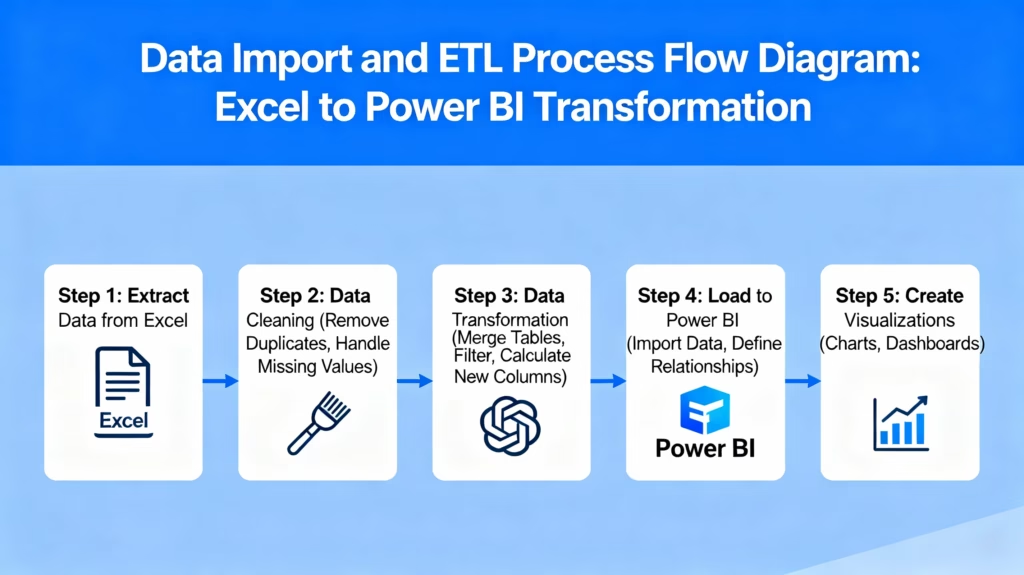
Step 1: Connect to Your Data Source
Power BI supports an extensive range of data sources. To begin, go to Home > Get Data and select your data source type. Common options for beginners include Excel files, CSV files, SQL databases, SharePoint lists, and Web connections. For your first dashboard, an Excel file is an excellent choice because it’s accessible and familiar.
Once you select your data source, navigate to the file location and select it. Power BI will display a preview of your data in the Navigator window. Here you’ll see all the tables available in your data source. Check the boxes next to the tables you want to import—don’t import unnecessary tables as they consume memory and slow down your dashboard.
It’s crucial to import only the data you actually need. Many beginners make the mistake of importing entire databases when they only need specific tables. This significantly impacts performance later. Take time to review what tables are available and consciously choose only those relevant to your dashboard’s purpose.
Step 2: Transform and Clean Your Data with Power Query
Before loading data into your data model, you’ll almost always need to clean and transform it. In the Navigator window, before clicking Load, select Transform Data to open the Power Query Editor. This is where you’ll perform essential data preparation tasks.
Common transformations include removing unnecessary columns (delete columns you won’t use), renaming column headers to be more readable, changing data types (ensuring dates are recognized as dates, not text), removing blank rows, and filtering out irrelevant records. For example, if you imported a sales table but only need data from the current year, you can filter out historical data here.
The Power Query Editor operates on a principle called query folding, where transformations you perform here are applied efficiently at the source, rather than loading everything into memory first. This significantly improves performance, especially with large datasets. Once you’ve completed your transformations, click Close & Apply to load the cleaned data into your Power BI model.
Step 3: Load Your Data
After clicking Load, Power BI processes your data and creates a semantic model—essentially a structured, optimized version of your data designed for fast analytics. This process might take a few seconds to a few minutes depending on your data size. You’ll know it’s complete when the data appears in the Fields Pane on the right side of the screen.
During this loading process, Power BI automatically attempts to detect relationships between your tables. This is helpful, but you should always review and verify these relationships to ensure they’re correct. Incorrect relationships lead to inaccurate analysis, which is a common beginner mistake.
Part 4: Building a Data Model – Establishing Relationships
Understanding Data Relationships
Before you create visualizations, you need to understand how your data tables connect. In most real-world scenarios, you’ll have multiple tables: fact tables (containing transaction data like sales, orders, or events) and dimension tables (containing descriptive information like customers, products, or dates).
One-to-Many relationships are the most common type. For example, one customer can have many orders. Here, the Customer table is on the “one” side and the Orders table is on the “many” side. This relationship structure allows Power BI to filter correctly when users interact with your dashboard.
Many-to-One relationships work similarly but are named from the opposite perspective. One-to-One relationships occur when each record in one table relates to exactly one record in another table. Many-to-Many relationships should be avoided in most cases because they can cause calculation errors and performance issues.
Creating Relationships: The Autodetect Method
Power BI can automatically detect relationships if your columns have matching names or obvious foreign key relationships. Go to Modeling > Manage Relationships and select the Autodetect button. Power BI will scan your tables and suggest relationships based on column names and data types.
Review these suggestions carefully. If they look correct, click OK to accept them. However, don’t blindly trust autodetect—verify that the relationships make logical sense for your data. For example, if Power BI suggests a relationship between CustomerID in two different tables, confirm that these IDs actually represent the same customers.
Creating Relationships: The Manual Method
For more control, you can manually create relationships by going to Modeling > Manage Relationships > New. In the Create Relationship dialog, select the first table and the column you want to relate (such as CustomerID from the Customers table). Then select the second table and its corresponding column (such as CustomerID from the Orders table).
Choose the appropriate cardinality (one-to-many, many-to-one, etc.) and set the filter direction. In most cases, you’ll use single direction filtering where the dimension table filters the fact table. Once everything looks correct, click OK to create the relationship.
The relationship diagram view is invaluable for understanding your data model at a glance. You can access this from View > Model to see a visual representation of all your tables and their connections. This visual perspective helps you identify missing relationships or incorrect configurations before they cause problems in your dashboards.
Part 5: Creating Visualizations – Choosing the Right Charts
Understanding Visualization Types
Power BI offers dozens of visualization types, each suited for different types of data stories. Understanding which visualization to use prevents your dashboard from becoming a confusing collection of random charts.
Bar Charts and Column Charts are your workhorses for comparing values across categories. Use them when you want to compare, for example, sales across different product categories or quarterly revenue performance. Bar charts display categories horizontally, while column charts display them vertically. Choose based on how many categories you’re comparing and space constraints on your page.
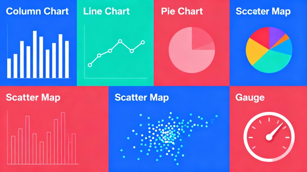
Line Charts excel at showing trends over time. If you need to visualize how sales have changed month-over-month or track website traffic week-by-week, line charts are ideal. They make trends immediately obvious and allow viewers to quickly spot seasonality or unusual spikes.
Pie Charts and Donut Charts display parts of a whole, showing how different segments contribute to a total. However, use these cautiously—human eyes struggle to accurately compare wedge sizes. They work best when you have three to five segments and want to show one dominant category. For precise comparisons, a column chart often communicates the same information more effectively.
Scatter Charts reveal relationships between two numeric variables. If you want to investigate whether advertising spend correlates with sales revenue or whether customer tenure relates to purchase frequency, scatter charts make these patterns visible.
Maps help with geographical analysis. Power BI automatically recognizes location data (country names, ZIP codes, latitude/longitude) and can create filled maps, bubble maps, or shape maps. These are particularly useful when regional performance differences are important to your story.
Cards display single metrics prominently. If you want to showcase “Total Sales: $2.4M” at the top of your dashboard, a card visualization makes this data pop. Use cards for KPIs or headline numbers that require immediate attention.
Tables show detailed data in row-and-column format. While not as visually compelling as charts, tables are essential when stakeholders need exact numbers rather than approximate trends.
Gauges resemble speedometers and display single values within acceptable ranges. They’re perfect for showing KPIs with target values, such as “Customer Satisfaction: 87% (Target: 85%).”
Creating Your First Visualization
Start by clicking any visualization icon in the Visualizations Pane on the right. Let’s create a column chart showing sales by product category. Click the column chart icon—this creates an empty visualization placeholder on your canvas.
Next, from the Fields Pane, drag the “Product Category” field to the Axis area and drag the “Sales” field to the Values area. Within seconds, Power BI generates a column chart showing sales for each product category. It automatically determines that sales should be summed (rather than averaged or counted), as that’s the most logical aggregation for this data.
To customize your visualization, explore the formatting options. Click on the paintbrush icon in the Visualizations Pane to access formatting options. Here you can change colors, add titles, adjust font sizes, and modify virtually every visual aspect of your chart.
Adding Multiple Visualizations
With one visualization created, add more to tell a complete data story. A comprehensive dashboard typically combines three to eight visualizations (too many causes visual clutter and performance issues). A recommended starting combination includes:
- Headline metrics (using Card visualizations) showing current performance against targets
- Trend analysis (Line chart) showing how key metrics have evolved
- Comparative analysis (Column chart) showing performance across categories
- Geographic analysis (Map) if location matters to your business
- Detailed data (Table) for stakeholders who need exact numbers
Each visualization should answer a specific question or support a particular insight. Avoid creating visualizations just to fill space; every element should serve a purpose in your data story.
Part 6: Adding Interactivity – Slicers and Filters
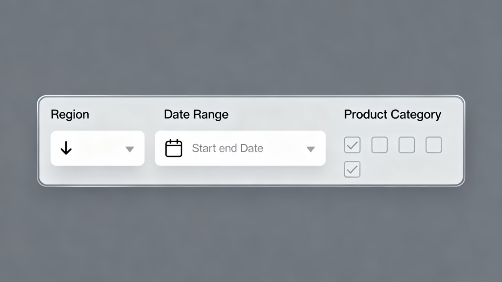
What Are Slicers?
Slicers are visual filters that appear directly on your dashboard canvas, allowing users to interactively filter data without opening dropdown menus. Rather than embedding filters in arcane menu structures, slicers make filtering obvious and intuitive.
Instead of a user wondering “How do I filter this dashboard by region?”, a slicer makes it immediately apparent—they see a list of regions they can click to filter all dashboard visuals simultaneously. This dramatically improves user experience and makes data exploration more engaging.
Creating Slicers
From the Visualizations Pane, select the Slicer icon. Unlike other visualizations, a slicer doesn’t display data values but instead displays available options for filtering. From the Fields Pane, drag the field you want to filter by (such as “Region”) into the slicer.
Power BI creates a list of all available regions. Users can click individual regions to filter all other visuals on the dashboard to show only that region’s data. Hold Ctrl and click to select multiple regions simultaneously.
You can customize slicer appearance by changing the layout—the slicer can display as a list (vertically or horizontally), a dropdown menu, or a date range picker (for date fields). Each layout option has advantages: dropdown slicers save space, list slicers are immediately obvious, and range slicers work perfectly for date filtering.
Configuring Slicer Interactions
By default, when you create a slicer, it filters all other visuals on the same page. However, you can fine-tune which visuals are affected by a slicer. Select the slicer, then go to Format > Visual Interactions. You’ll see filter icons above each visualization.
Click a filter icon to toggle whether that visualization is affected by this slicer. This provides granular control—perhaps you want one slicer to filter most visuals but leave your headline metrics unaffected, providing a consistent context for comparison.
When to Use Filters vs. Slicers
Page-level filters appear in a filter pane and affect all visuals on the page. These are useful for global filtering that applies to the entire page context.
Visual-level filters appear in the filter pane for a specific visualization and only affect that single visual. These work best when you need special filters for individual visuals.
Slicers are visual filters on the canvas and affect all relevant visuals. These are most user-friendly because users see filter options immediately without opening additional panes.
For your first dashboard, start with one or two slicers by important dimensions like Region, Year, or Product Category. Avoid excessive slicers—reports with more than four slicers often create information overload and sluggish performance.
Part 7: Designing for Impact – Layout and Formatting
Dashboard Layout Principles
The placement and arrangement of your visualizations dramatically impacts how effectively your dashboard communicates information. Prioritize by placement: place your most important metrics and visualizations at the top-left where viewers’ eyes naturally focus first. Secondary insights appear in secondary positions.
Use a consistent grid layout with visualizations aligned to improve aesthetic appearance and professional presentation. Most dashboards look best when visualizations are aligned vertically and horizontally, creating a clean, organized appearance rather than scattered random placement.
Implement visual hierarchy using size, color, and position. Headline metrics (KPIs) should be larger and more prominent than supporting visualizations. Draw attention to critical information through strategic placement and sizing.
Leave white space intentionally rather than cramming every available pixel with content. White space prevents visual fatigue and makes dashboards easier to scan and comprehend.
Color Strategy
Colors serve multiple purposes in dashboard design: highlighting important information, creating visual consistency, and making data exploration intuitive. However, careless color choices create confusion and reduce accessibility.
Use a limited, consistent color palette throughout your dashboard. Stick to three to five primary colors supplemented by neutral backgrounds. This consistency makes your dashboard professional and cohesive.
Employ contrasting colors for data series that need clear distinction. However, avoid red-green combinations because approximately 8% of men have red-green color blindness.
Use semantic colors where appropriate: red for negative/warning values, green for positive/goal achievement, yellow for caution. These associations are intuitive and require no explanation.
Consider accessibility when selecting colors. Tools like color blindness simulators can help ensure your dashboard is readable for all users. Never rely on color alone to convey meaning—always use labels or legends as well.
Adding Titles and Context
Every visualization should have a clear, descriptive title explaining what data it represents. “Sales by Region” is better than “Chart 1.” Titles guide viewers to understand each visualization’s purpose.
Add data labels directly on visualizations where appropriate. Instead of requiring users to hover over bars to see exact values, label key data points directly on the chart. This reduces interaction needed and speeds comprehension.
Include a dashboard title and description at the top clearly identifying what the dashboard represents and its purpose. For example: “Q4 2024 Sales Performance Dashboard – Updated Daily”
Create a legend that explains any symbols, colors, or formatting conventions used. If color coding represents different status levels (red=critical, yellow=warning, green=normal), this should be explicitly shown.
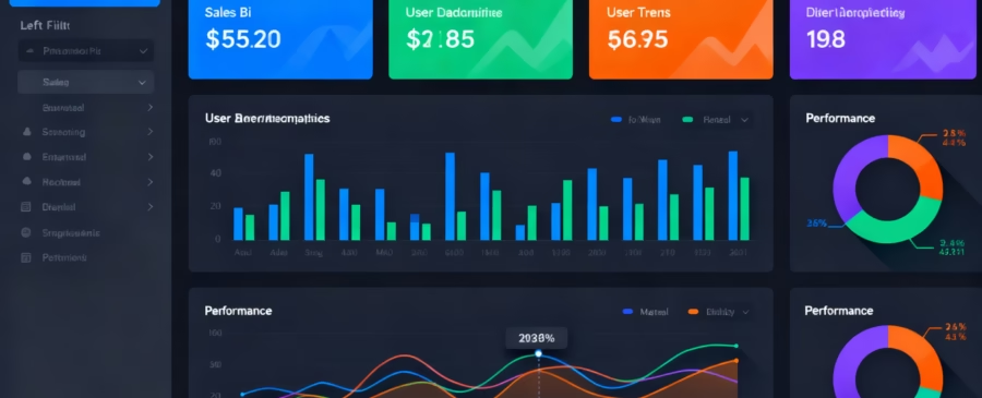
Part 8: Building the Dashboard – Pinning Visualizations
From Report to Dashboard
Once you’ve created visualizations telling a cohesive story, you’re ready to create your dashboard. In Power BI, a report is a collection of visualizations on one or more pages used for analysis. A dashboard is a single-page summary created by pinning visualizations from reports.
To create a dashboard, select a visualization on your report and click the Pin Visual icon (typically a pushpin icon in the top-right corner of the visualization). A dialog appears asking whether you want to pin to an existing dashboard or create a new dashboard.
For your first dashboard, select New Dashboard and give it a meaningful name like “Q4 Sales Dashboard” or “Marketing Performance Tracker.” Power BI creates your new dashboard and pins the selected visualization to it.
Pinning Multiple Visualizations
Repeat this process for each visualization you want to include on your dashboard. With each pin, Power BI adds a new tile to your dashboard. Once you’ve pinned all desired visualizations, navigate to your dashboard in Power BI Service to see how it looks.
Click Go to Dashboard after each pin to see the current state, or wait until you’ve pinned several visualizations and then navigate to your workspace to view the complete dashboard.
Organizing Dashboard Tiles
On your dashboard, tiles representing each pinned visualization are initially placed in a default grid. Click Edit Dashboard (in the top menu) to enter edit mode where you can rearrange and resize tiles.
Click and drag tiles to reposition them. Hover over a tile’s corner and drag to resize it—tiles can expand from 1×1 (small) to 5×5 (large). Arrange visualizations so the most important information appears prominently.
For a well-designed dashboard:
- Top-left: Place headline KPIs in card format
- Top-middle and right: Critical trend visuals
- Bottom sections: Supporting detailed analysis
- Slicers: Often placed at the top or left side for easy access
Creating Multiple Dashboard Pages
If your data story is complex, don’t force everything onto one page. Many dashboards work better as multi-page reports with a landing page overview and detailed pages for deeper analysis.
In Power BI Desktop, create multiple report pages, then pin visualizations from different pages to your dashboard. Your dashboard becomes a single-page overview that users can navigate through while maintaining the ability to click through to detailed report pages for deeper exploration.
Part 9: Advanced Interactivity – Drill-Through and Bookmarks
Enabling Drill-Through Navigation
Drill-through functionality lets users click on a data point in one visual to see detailed information on another report page. This creates a natural exploration path: start with high-level overview, then drill down to supporting details.
To set up drill-through, create a detailed report page showing granular data. For example, if your main dashboard shows sales by region, create a detailed page showing specific sales transactions for that region.
On the detailed page, go to Format > Drill Through and select the field(s) users will use to drill through. Then, on your main visualization, enable drill-through by going to Format > Interaction Type > Drill Through.
Now when users right-click a data point in your main visualization and select Drill Through, Power BI navigates to the detailed page and filters it to show data relevant to that selection.
Using Bookmarks for Report Navigation
Bookmarks save specific dashboard states, allowing users to click a button and instantly jump to predefined configurations. For example, you might create bookmarks for “Current Year View” and “Year-over-Year Comparison,” letting users toggle between these pre-built perspectives.
To create a bookmark, configure your dashboard exactly as you want it (apply specific filter selections, slicer settings, and zoom levels). In Power BI Desktop, go to View > Bookmarks > New to create a bookmark capturing this state.
Create multiple bookmarks representing different analysis scenarios. Then add buttons to your dashboard that, when clicked, activate specific bookmarks. This gives your dashboard the feel of a polished application rather than raw analytics interface.
Part 10: Sharing Your Dashboard – Publishing and Permissions
Publishing to Power BI Service
With your dashboard ready, it’s time to share it. Click File > Publish in Power BI Desktop. You’ll see a dialog asking where to publish—select your workspace (typically “My Workspace” for your first dashboard) and click Select.
Power BI uploads your report and data to the cloud. Once complete, you’ll see a success message with a link to your published content. Click this link to open your dashboard in Power BI Service.
Your dashboard is now published to the cloud and accessible wherever you have internet access. You can return to edit it from either Power BI Desktop (make changes locally and republish) or Power BI Service (make changes directly in the cloud interface).
Sharing Your Dashboard
In Power BI Service, open your dashboard and click the Share button in the top menu. Power BI presents sharing options:
Share with specific people: Enter email addresses of colleagues who should have access. Choose between giving them view-only access or edit permissions (if you want them to modify the dashboard).
Share with your organization: Create a shareable link that anyone in your organization can access (requires proper tenant configuration).
Publish as app: Package your dashboard into an app that can be distributed to large groups or your entire organization. This is ideal for dashboards meant for broad audiences.
When sharing, set appropriate permissions. View permission lets recipients see the dashboard but not modify it. Edit permission lets them change the dashboard. Reshare permission lets them share with others. Only grant permissions necessary for each person’s role.
Managing Access and Permissions
As your dashboard gets shared more widely, you’ll need to manage who has access. Go to the dashboard settings to view all users with access and adjust their permissions.
For sensitive data, consider implementing Row-Level Security (RLS), which restricts data visibility based on the logged-in user’s identity. For example, sales managers see only their region’s data, while executives see company-wide data. Setting up RLS requires technical expertise but is essential for compliance-sensitive organizations.
Part 11: Common Beginner Mistakes to Avoid
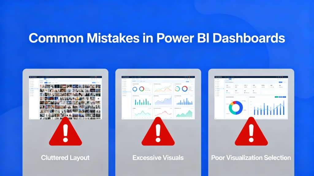
Mistake 1: Overloading with Too Many Visuals
Beginners often create comprehensive dashboards with twenty or thirty visualizations thinking “more data = better insights.” The opposite is true. Cluttered dashboards overwhelm users, make it difficult to focus on critical metrics, and suffer from performance issues.
Instead, limit your dashboard to five to eight well-chosen visualizations that collectively tell a complete story. If you have additional analysis, create multiple focused dashboards or detailed report pages rather than cramming everything onto one view.
Mistake 2: Ignoring Data Model Relationships
Skipping proper relationship configuration causes incorrect filters and misleading analysis. Users filter by one dimension expecting consistent results across all visuals, but due to missing or incorrect relationships, visuals show contradictory information.
Before creating visualizations, invest time in setting up relationships correctly. Use the model view to verify your relationship diagram looks logical. Test that slicers filter visuals as expected before sharing your dashboard with others.
Mistake 3: Poor Visualization Selection
Choosing the wrong visualization type for your data undermines your message. Using pie charts for precise comparisons, line charts for categorical data, or maps when geography isn’t relevant all obscure rather than clarify insights.
For each visualization, ask: “Is this the clearest way to show this data?” If you can’t answer yes, choose a different visualization type. Refer to best practices for which visualization type works best for different data and analytical questions.
Mistake 4: Neglecting Performance Optimization
As your dashboards grow more complex, performance inevitably suffers unless you’re intentional about optimization. Slow dashboards that take 30 seconds to load frustrate users and get abandoned.
Remove unused columns from your data model early. Use the Performance Analyzer (View > Performance Analyzer) to identify slow visuals and optimize them. Minimize the number of slicers, as each adds computational complexity.
Mistake 5: Unclear Titles and Labels
Visualizations without clear titles and proper axis labels create confusion. Users shouldn’t need to guess what a visualization represents. “Total by Category” is clear; “Chart 1” is not.
Label all axes, include descriptive visualization titles, and add data labels to important data points. Treat your dashboard as if viewers are encountering it for the first time—because they are.
Mistake 6: No Data Validation Before Visualization
Building dashboards on dirty data leads to incorrect insights. Missing values, inconsistent formatting, duplicate records, or data quality issues in your source can silently corrupt your analysis.
Before you start building visualizations, thoroughly validate your data. Check for missing values, verify data types, remove duplicates, and handle outliers appropriately. Time spent on data preparation prevents hours of troubleshooting later.
Part 12: Optimization Tips for Performance
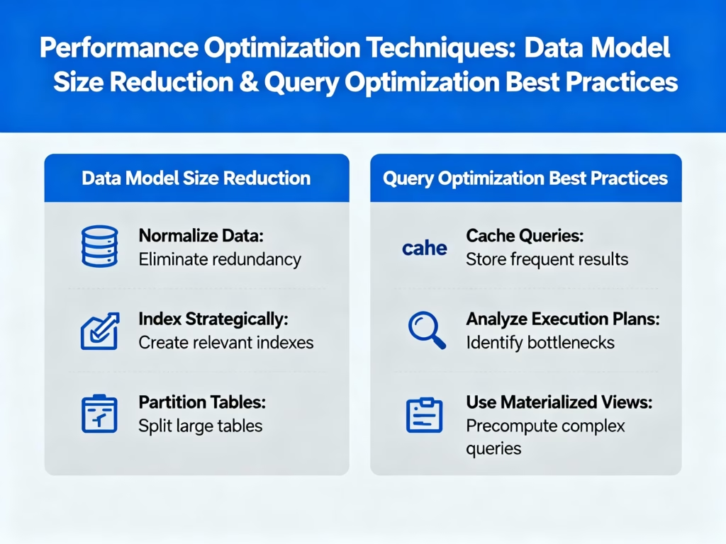
Reduce Data Model Size
Every column in your data model consumes memory and processing power. Before loading data, identify and remove columns you won’t use. If you imported “unnecessary” columns thinking they “might be useful someday,” delete them.
Use integer keys for connecting tables instead of long text descriptions. Connecting on “CustomerID” (a simple number) is much faster than connecting on “Customer Full Name with Complete Address” (verbose text).
Use the Star Schema
Organize your data into a star schema: a central fact table (containing transactions) surrounded by dimension tables (containing descriptive information). This structure matches how Power BI’s internal engine processes queries, resulting in dramatically faster performance.
If you inherited a complex snowflake schema with many interconnected tables, consider flattening it or restructuring it during data import to match the star schema pattern.
Optimize Visualizations
Limit the number of visuals on each page. Each visual requires processing power, and reports with excessive visuals (20+) often suffer noticeable performance degradation.
Use the Performance Analyzer (View > Performance Analyzer) to measure how long each visual takes to render. Focus optimization efforts on the slowest visuals first.
Implement Aggregations for Large Data
If your fact table contains millions of rows, aggregating data at the source or creating aggregate tables in Power BI dramatically improves query speed. Rather than Power BI summing ten million rows every time someone refreshes a visual, pre-aggregated data provides instant results.
Part 13: Maintaining Your Dashboard
Setting Up Data Refresh
Your dashboard is only valuable if it reflects current data. Once published to Power BI Service, set up scheduled refresh so your data updates automatically.
Go to your dataset in Power BI Service, select Settings > Refresh Schedule, and specify how frequently your data should refresh (daily, twice daily, etc.). Your organization’s license tier determines maximum refresh frequency—typically ranging from one to eight times daily.
Monitoring Dashboard Usage
Power BI Service provides usage analytics showing how many people view your dashboard and which visuals they interact with. Use this information to iterate and improve your dashboard.
If certain visuals receive heavy interaction while others are ignored, this suggests those visuals provide valuable insights. Conversely, ignored visuals might be removed to simplify the dashboard.
Iterating Based on Feedback
Dashboards are never “done.” Share your initial version with users and gather feedback. Are critical metrics missing? Do users find the layout confusing? Are there calculations they need that aren’t present?
Build version 2.0 incorporating feedback. This iterative approach typically results in more useful dashboards than trying to get everything perfect on the first attempt.
Conclusion: Your Dashboard Journey
Building your first Power BI dashboard is an exciting milestone in your data analytics journey. You’ve learned to import and prepare data, establish proper relationships, create impactful visualizations, add interactivity, and share your insights with stakeholders.
Remember that dashboard design is both a science and an art. The science involves technical skills: data modeling, visualization selection, and performance optimization. The art involves communication: choosing visualizations that tell a compelling story, designing layouts that guide viewers, and creating experiences that make data exploration intuitive.
Your first dashboard won’t be perfect, and that’s perfectly fine. Each dashboard you create builds your skills and provides learning opportunities. Pay attention to user feedback, monitor performance, and continuously improve.
The power of Power BI lies in its ability to democratize data analytics. You don’t need advanced technical degrees to create professional dashboards that drive business decisions. With the knowledge from this guide and consistent practice, you’ll be creating sophisticated, impactful dashboards that transform your organization’s data into actionable insights.
Start building today. Your first dashboard is waiting to tell your data’s story.