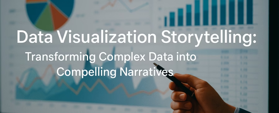
Introduction to Data Visualization Storytelling
In today’s data-driven world, raw numbers and spreadsheets are no longer enough to inspire action. People don’t connect emotionally with endless tables of statistics; they connect with stories. This is where data visualization storytelling comes into play. It transforms overwhelming streams of information into engaging narratives that both inform and inspire. Instead of presenting numbers in isolation, it places them in a context that resonates with the human brain’s natural preference for stories.
Think of it this way: if someone tells you that 3 billion people worldwide use social media, you might nod in acknowledgment. But if that same statistic is shown through a powerful graphic comparing it to the world’s total population and then tied to a story about digital culture’s global impact, you suddenly feel the significance. Numbers alone might fade from memory, but stories stick.
At its core, data storytelling is about more than just presenting facts; it’s about shaping narratives that explain the “why” behind the data. It bridges the gap between analytical thinkers who love numbers and the broader audience who craves meaning. By combining visualization techniques with compelling storytelling, businesses, researchers, and journalists can turn complex insights into actionable knowledge that drives decisions.
In a world overflowing with data, the challenge is not gathering it—it’s making sense of it. That’s why storytelling has become the soul of data communication. It transforms numbers from static points into dynamic narratives that move people to act.
The Evolution of Data Visualization
Data visualization has been around for centuries, long before the term “big data” ever existed. Early examples date back to maps, star charts, and even hand-drawn diagrams used to track trade routes and population growth. These primitive yet effective tools laid the foundation for what we now know as modern visualization.
The 18th and 19th centuries brought groundbreaking works like William Playfair’s line and bar charts, which provided a structured way to display trends over time. Florence Nightingale’s famous coxcomb charts during the Crimean War demonstrated how data could influence policy and save lives. These were early forms of storytelling through data, though they lacked the digital polish of today’s tools.
Fast forward to the digital revolution, and we see an explosion of possibilities. The introduction of spreadsheets like Microsoft Excel democratized visualization, giving everyday users the power to create charts and graphs. Then came interactive dashboards with platforms like Tableau and Power BI, which allowed organizations to explore real-time insights at the click of a button.
Now, with AI and machine learning, we’re entering a new era where data visualization isn’t just descriptive but predictive. Algorithms can uncover hidden patterns and create visual stories automatically, allowing businesses to act faster and smarter. The journey from static charts to dynamic, interactive, and AI-driven storytelling highlights how essential data visualization has become in shaping decisions across industries.
Why Storytelling in Data Matters
Why not just stick to plain graphs and reports? Because humans don’t think in spreadsheets—they think in stories. Stories give data purpose, context, and meaning. Without them, information can feel sterile, overwhelming, or even meaningless.
One of the main reasons storytelling is vital in data is decision-making. Studies show that people are more likely to act when information is presented in narrative form rather than as raw statistics. A graph might show a decline in sales, but a story explaining how shifting customer behaviors and market trends caused that decline makes the information actionable.
Storytelling also creates an emotional connection. Numbers on their own rarely spark feelings, but when tied to real-world examples, they resonate. For instance, saying “1 in 9 people globally suffer from hunger” is informative. But telling the story of a child who struggles daily because of food scarcity paints a vivid picture that motivates empathy and action.
In the world of business, this emotional resonance is gold. It helps brands connect with their audiences, inspires employees, and persuades stakeholders. Without storytelling, data risks becoming background noise. With it, data becomes a voice—a narrative that speaks directly to human hearts and minds.
Core Principles of Data Visualization Storytelling
To craft compelling stories with data, certain principles must be followed. These act as the foundation for turning complex data into digestible, engaging narratives.
- Clarity and Simplicity
The best data stories strip away unnecessary noise. Overloading visuals with too many colors, metrics, or dimensions only confuses the audience. A clear, straightforward presentation ensures that the message stands out. - Relevance and Context
Data without context is meaningless. The audience needs to understand not just the “what” but also the “why.” For example, showing a spike in website traffic is interesting, but explaining that it was driven by a viral marketing campaign adds the necessary context. - Accuracy vs. Interpretation
While storytelling encourages interpretation, it should never distort the facts. Manipulating scales or cherry-picking data might make a story more dramatic, but it undermines credibility. The golden rule is: tell the story truthfully, even if the numbers don’t look as impressive as you hoped.
These principles ensure that data visualization storytelling doesn’t just look appealing but also serves its true purpose—communicating insights effectively. A story without clarity is confusing, a story without context is hollow, and a story without accuracy is misleading. By following these guidelines, data can transform into a powerful narrative tool.
The Role of Human Psychology in Data Storytelling
Data storytelling works so well because it taps into how the human brain naturally processes information. Our brains are wired to recognize patterns and connect dots, making visualization an ideal tool for comprehension.
Consider this: the human brain processes images 60,000 times faster than text. This means a well-designed chart or infographic can convey more meaning in a few seconds than paragraphs of explanation. This isn’t just about speed—it’s about retention. People remember stories and visuals far better than raw facts.
Psychology also explains why emotionally charged stories stick with us. Neuroscience shows that when we experience emotion while learning something, our brains release dopamine, which strengthens memory formation. This is why a story tied to data is far more impactful than data presented in isolation.
Additionally, the principle of cognitive load plays a role. People have limited capacity to process information at once. Overwhelming them with too many numbers or charts leads to disengagement. Storytelling reduces this load by packaging data into a narrative sequence, making it easier to digest.
In essence, storytelling with data isn’t just a nice-to-have—it’s a necessity. It aligns with the way humans think, learn, and make decisions. That’s why organizations that master this skill don’t just share information; they inspire action.
Types of Data Visualizations and Their Narratives
Not all data visualizations are created equal, and choosing the right type of visualization can determine how effective the story will be. Each visualization type has its strengths, weaknesses, and ideal use cases, which means the format you select directly impacts how your audience interprets your message.
- Charts and Graphs
The most common type of data visualization, charts and graphs include bar charts, pie charts, line graphs, and scatter plots. They are excellent for showing comparisons, distributions, and trends over time. For example, a line graph can tell the story of company growth, while a pie chart can reveal market share distribution. - Infographics
Infographics combine text, visuals, and design elements to communicate a story in one cohesive image. They’re highly shareable, making them a favorite in marketing and social media campaigns. Infographics don’t just display data—they wrap it in context, visuals, and narrative cues to make it digestible and engaging. - Interactive Dashboards
Tools like Tableau and Power BI allow for dashboards where users can explore the data themselves. Interactive dashboards tell multiple stories depending on how the user engages with them. This flexibility makes them especially useful in business settings where stakeholders may have different questions about the same dataset. - Motion Graphics and Animations
Animated data storytelling is on the rise, especially in digital media and journalism. A moving visualization can highlight trends, transitions, and shifts in a way static charts cannot. Imagine a time-lapse animation showing climate change data—it not only informs but also evokes an emotional response.
The key to selecting the right type of visualization is aligning it with the narrative you want to tell. If the story is about growth, a line chart works. If it’s about proportion, a pie chart might be better. For complex, layered stories, interactive dashboards or infographics may be ideal.
Crafting a Data-Driven Story
Creating a compelling story from data isn’t about dumping all the statistics into a graph and calling it a day. It’s about designing a narrative arc where the data plays the role of supporting evidence to a central theme or takeaway.
- Identify the Main Message
Every great story starts with a central idea. Ask yourself: What do I want my audience to walk away with? If you can’t summarize the key insight in one sentence, your story isn’t clear enough. - Structure the Narrative Flow
Just like a novel or a movie, data stories should follow a structure. Begin with a problem or question, present the evidence through data, and then conclude with insights and recommendations. This beginning–middle–end approach ensures the audience follows the logic naturally. - Use Storytelling Frameworks
Classic storytelling frameworks like “The Hero’s Journey” can be adapted to data. For instance, the “hero” could be a company facing declining sales, the “villain” might be changing consumer behavior, and the “resolution” comes from insights gained through data analysis.
A strong data-driven story blends logic with emotion. It makes the audience care about the information being presented and equips them with insights that drive decisions. Without structure, even the most interesting data risks being ignored. With structure, it becomes memorable and impactful.
The Intersection of Design and Data
Design is the bridge that connects raw data with human understanding. Poorly designed visuals can distort meaning, confuse viewers, or simply bore them. On the other hand, thoughtful design can make complex information instantly clear and engaging.
- Choosing the Right Visuals
A common mistake in data visualization is picking visuals that look impressive but don’t align with the story. For example, a 3D pie chart might grab attention, but it can distort proportions and mislead viewers. Instead, the design should always prioritize clarity over flashiness. - Color Psychology in Data Design
Colors do more than make visuals look pretty—they carry meaning. Red often signals danger or decline, while green represents growth and positivity. Blue tends to be associated with trust and stability. Using color intentionally can enhance storytelling by reinforcing the message behind the numbers. - Accessibility in Visualization
Not all audiences perceive visuals the same way. Some may be colorblind, while others may have cognitive challenges. Accessible design—such as using high-contrast palettes, clear labeling, and alternative text descriptions—ensures your story reaches the widest possible audience.
When data meets design, the result is more than just a graph—it’s a narrative tool. Design choices either enhance or diminish the story you want to tell, which is why attention to detail is essential. A well-crafted visualization doesn’t just show data—it tells a story in one glance.
Tools and Platforms for Data Visualization Storytelling
Thanks to technology, telling stories with data has never been easier. There are countless platforms available, ranging from beginner-friendly tools to advanced coding libraries.
- Tableau and Power BI
These are industry leaders in business intelligence dashboards. They allow users to create interactive, real-time visualizations that stakeholders can explore. Tableau is known for its flexibility and design capabilities, while Power BI integrates seamlessly with Microsoft’s ecosystem. - Google Data Studio
A free and accessible option, Google Data Studio connects with various data sources like Google Analytics and Sheets, making it an excellent choice for marketers and small businesses. - D3.js and Flourish
For more advanced users, D3.js (a JavaScript library) offers complete customization of data visualizations. Flourish, on the other hand, provides a no-code platform for creating interactive and animated stories, making it easier for journalists and communicators. - AI-Enhanced Storytelling Tools
Emerging tools leverage artificial intelligence to automatically analyze data and suggest stories. These platforms not only save time but also ensure that key insights aren’t overlooked.
Choosing the right tool depends on your goals. For corporate presentations, dashboards like Power BI may suffice. For publishing data stories in media, tools like Flourish or motion graphics platforms may be better suited. Ultimately, the best tool is the one that allows you to tell your story clearly and effectively.
Real-World Applications of Data Visualization Storytelling
The beauty of data storytelling is that it’s not limited to one field. Its versatility makes it valuable across industries, each using it to achieve specific goals.
- Business and Marketing
Companies use data storytelling to track consumer behavior, sales performance, and market trends. A marketing team might use visualization to show how a campaign boosted engagement, while a CEO might use it to communicate financial performance to investors. - Healthcare and Science
Data storytelling plays a crucial role in public health. During the COVID-19 pandemic, visual dashboards helped governments and citizens understand infection rates, hospital capacities, and vaccination progress. In science, visualizations help explain complex research findings to both experts and the general public. - Government and Policy-Making
Policymakers rely on data storytelling to communicate the impact of decisions. For example, visualizations on climate change data can persuade the public and lawmakers to support sustainability initiatives. - Journalism and Media
Data journalism is booming, with news outlets using interactive graphics to explain elections, economic shifts, and global issues. Instead of publishing dense reports, journalists craft visual stories that captivate audiences.
The common thread across all these industries is impact. Whether it’s convincing investors, educating the public, or driving policy changes, data visualization storytelling ensures the message doesn’t just get seen—it gets remembered and acted upon.
Case Studies of Powerful Data Narratives
Nothing proves the impact of data storytelling better than real-world examples. Across industries, organizations have used data-driven narratives to influence decisions, inspire action, and shift public opinion. Let’s look at a few powerful case studies.
- Florence Nightingale’s Coxcomb Charts
One of the earliest and most famous cases comes from Florence Nightingale during the Crimean War. She used innovative diagrams, known as coxcomb charts, to demonstrate that most soldier deaths were due to preventable diseases rather than battlefield injuries. Her storytelling through data didn’t just highlight a problem—it pushed governments to reform medical sanitation practices. This example shows how effective storytelling can literally save lives. - The New York Times and COVID-19 Dashboards
During the COVID-19 pandemic, The New York Times became a global reference point for visual data journalism. Their interactive dashboards allowed readers to track cases, deaths, and vaccination progress at both local and global levels. By combining real-time data with engaging visual narratives, they kept the public informed and empowered. The storytelling aspect was key—by presenting the crisis as a human-centered narrative rather than just numbers, they built trust and drove awareness. - Spotify Wrapped Campaign
Spotify revolutionized marketing by turning user data into personalized stories. Each year, millions of users eagerly await their “Spotify Wrapped,” which visualizes their listening habits in colorful, shareable formats. The genius behind this campaign is its narrative approach—it doesn’t just show numbers, it frames them as part of a personal music journey. This campaign highlights how businesses can use storytelling not only for insights but also for customer engagement. - Gapminder and Hans Rosling’s Presentations
Hans Rosling, the late Swedish statistician, brought global development data to life through Gapminder. His animated bubble charts showed changes in wealth, health, and population over decades, often challenging misconceptions about the developing world. Rosling’s dynamic storytelling style made complex global trends accessible to everyone, from students to policymakers.
These case studies highlight a recurring theme: the most impactful data stories don’t just inform, they engage. They appeal to both logic and emotion, ensuring that insights translate into real-world action.
Challenges in Data Visualization Storytelling
While data storytelling has enormous potential, it’s not without challenges. Organizations often struggle to balance clarity, accuracy, and engagement. Let’s explore the most common hurdles.
- Information Overload
With access to massive datasets, the temptation is to show everything. But too much data can overwhelm the audience, diluting the key message. Effective storytellers must make tough choices about what to include and what to leave out. The goal is not to show all the data, but the right data that supports the narrative. - Misrepresentation of Data
Poorly designed visuals can distort reality. For instance, manipulating chart scales can exaggerate trends, while using inappropriate chart types can confuse rather than clarify. Intentional or not, this misrepresentation damages credibility. Ethical responsibility is critical in data storytelling—trust once lost is hard to regain. - Audience Diversity
Not every audience has the same level of data literacy. A technical team might appreciate detailed scatter plots, while executives may prefer simple infographics. Crafting one story that resonates with all stakeholders is a challenge. Often, storytellers must adapt the same dataset into different formats depending on the audience. - Emotional vs. Rational Balance
While emotion makes data stories memorable, leaning too heavily on it can risk sensationalism. For instance, in journalism, overly dramatic narratives may overshadow the factual integrity of the data. The challenge lies in striking a balance—engaging without exaggerating. - Keeping Stories Dynamic
Data is constantly evolving. A story based on yesterday’s insights may be outdated tomorrow. This is particularly challenging in fast-moving industries like finance, marketing, and healthcare. Storytellers must update narratives regularly to maintain relevance.
Recognizing these challenges is the first step toward overcoming them. With careful planning, ethical design, and audience awareness, data storytellers can navigate these obstacles and craft narratives that are both truthful and compelling.
The Future of Data Storytelling
As technology advances, the way we tell stories with data is evolving rapidly. The future promises more interactive, immersive, and personalized storytelling experiences. Here’s what lies ahead:
- AI and Machine Learning in Visual Narratives
Artificial intelligence is transforming data storytelling. AI tools can analyze massive datasets, identify patterns, and even suggest the best visuals to tell a story. This automation saves time and reduces the risk of overlooking important insights. In the future, we may see AI-driven platforms that create real-time, personalized narratives for different audiences. - Virtual Reality (VR) and Augmented Reality (AR)
Imagine stepping into a virtual room where data points float around you, and you can explore trends by moving through space. VR and AR are opening new frontiers for data storytelling, especially in education, healthcare, and urban planning. These immersive experiences make data not just something you see, but something you feel. - Predictive Storytelling
Instead of only telling stories about the past or present, future storytelling will increasingly focus on predictions. Using predictive analytics, organizations can visualize potential scenarios and outcomes, helping decision-makers prepare for what’s ahead. For example, climate models can show not only current trends but also future impacts under different policy choices. - Hyper-Personalization
Just like Spotify Wrapped, future data storytelling will become highly personalized. Businesses will tailor stories to individual customers, employees, or stakeholders, creating more relevance and engagement. Personalized dashboards, AI-powered summaries, and individualized reports will become the norm. - Ethical and Responsible Storytelling
As data becomes more powerful, so does the responsibility to use it ethically. Transparency, inclusivity, and fairness will be core principles of future storytelling. Audiences are becoming more aware of data manipulation, and trust will be a critical differentiator.
The future of data storytelling is not just about better tools—it’s about deeper human connection. By combining cutting-edge technology with timeless storytelling principles, the next generation of data narratives will be more impactful, immersive, and actionable than ever before.
Best Practices for Data Storytelling Success
Crafting a data story that resonates takes more than just visuals and numbers—it requires strategy, empathy, and discipline. Following best practices ensures your narrative doesn’t just inform but also inspires.
- Keep It Simple and Focused
The strongest stories are often the simplest. Avoid cluttered dashboards or overcomplicated charts. Ask yourself: If someone only remembers one thing from this story, what should it be? That key insight should guide the entire presentation. - Know Your Audience
A common mistake is presenting the same story to all audiences. Executives may need high-level summaries, while analysts want detailed breakdowns. Tailoring your story to the audience’s needs ensures engagement. Think of it like telling the same story to a child versus a colleague—you use different language, but the essence remains the same. - Use Emotion Wisely
Data storytelling thrives when it connects emotionally. But be cautious—emotion should complement the data, not overshadow it. For instance, a visualization about climate change might use striking colors and real-world examples, but it should still be anchored in accurate data. - Leverage Comparisons
Humans understand information better when it’s put into context. Instead of saying “10,000 units were sold,” compare it to last year’s sales or to a competitor’s performance. Comparisons transform abstract numbers into relatable stories. - Avoid Common Mistakes
- Using too many colors that distract rather than clarify
- Presenting irrelevant data that doesn’t serve the main message
- Ignoring accessibility (colorblind-friendly palettes, legible fonts, etc.)
- Overloading one chart with too many variables
- Measure Impact
How do you know if your story worked? Track engagement, retention, and outcomes. Did your story inspire decisions, change perspectives, or drive action? Collecting feedback ensures continuous improvement in storytelling methods.
In short, best practices revolve around clarity, empathy, and truthfulness. If you respect your audience’s time, guide them clearly, and tell the truth, your data stories will leave a lasting impact.
Conclusion
Data storytelling is more than a buzzword—it’s the bridge between cold numbers and human understanding. In a world overflowing with data, simply presenting information isn’t enough. People need context, emotion, and meaning to turn insights into action. That’s exactly what storytelling provides.
From Florence Nightingale’s charts that saved lives to Spotify’s personalized campaigns that captured hearts, the power of data storytelling lies in its ability to make information memorable and persuasive. It combines the logic of data with the emotion of stories, creating a synergy that resonates with audiences of all kinds.
Looking ahead, technologies like AI, VR, and predictive analytics will reshape how we tell stories with data. But no matter how advanced the tools become, the essence will remain the same: clear, ethical, and human-centered storytelling.
If you want your data to truly make a difference—whether in business, healthcare, government, or media—you must go beyond the numbers. Tell a story. Because in the end, it’s not the data people remember—it’s the story behind it.
FAQs
1. What is data visualization storytelling?
Data visualization storytelling is the practice of combining visuals (charts, graphs, infographics) with narrative elements to present data in a way that is clear, engaging, and memorable.
2. Why is storytelling important in data communication?
Storytelling helps audiences connect emotionally with information, improves retention, and makes complex insights actionable. Without storytelling, data often feels abstract and overwhelming.
3. What tools are best for data storytelling?
Popular tools include Tableau, Power BI, Google Data Studio, D3.js, and Flourish. The best tool depends on your goals, audience, and level of expertise.
4. How do you avoid misleading data stories?
Stick to ethical practices: use accurate scales, avoid cherry-picking data, and ensure visual clarity. Always prioritize truth over dramatization.
5. What’s the future of data storytelling?
The future will see more AI-driven narratives, immersive experiences with VR/AR, predictive storytelling, and hyper-personalization, all while emphasizing ethical and responsible communication.